College Recruitment Materials Review: Some More Winners
I know you all have just been chomping at the bit to read about some more of my favorite college recruitment marketing winners in more categories that I made up just for fun. Without further ado, here they are…
Winner: Best Use of College Mascot
Drexel University, Philadelphia, Pennsylvania
I know absolutely nothing about this university, however the poster that they sent has a huge dragon on it, therefore it must be a cool place. I mean how many colleges have a dragon for their mascot? The Big One is definitely not moving to Pennsylvania, so I will never get to wear a dragon mom sweatshirt, but I do love their marketing poster!

Winner: Best Use of Personalization
Rochester Institute of Technology
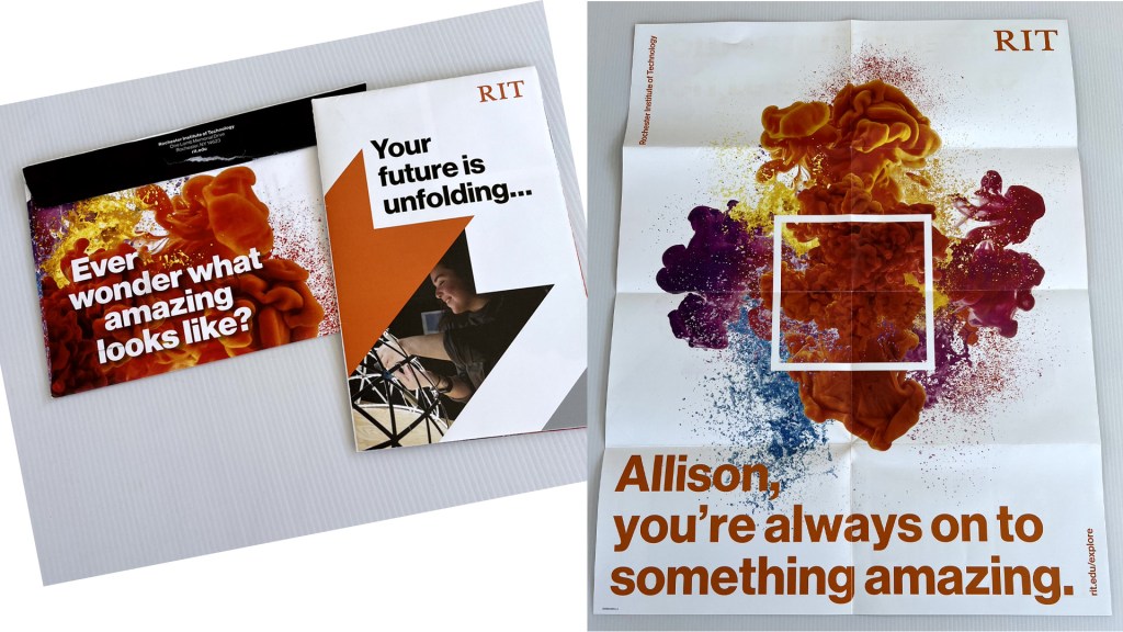
We read this one because it has technology in the college name. Never heard of it, but the materials were top notch. The letter was a ½ sheet, short, succinct and to the point. I was interested and wanted to learn more about the school based on the writing. Then came the poster! Full color, glossy. The play on words, “Your future is unfolding…” as you open the piece to learn more was a nice touch. Big images. Big Font. It was not overwhelming and then the personalized poster once fully unfolded was a nice touch. We’ll never do anything with the poster, but it was a cool piece to receive.

Winner: Most Persistent/ Biggest Surprise
Taylor University, Upland, Indiana
This next one, is tough. Taylor University is sitting at two extremes. They sent six separate pieces over the last year. The four postcards are pretty standard and honestly kind of boring. They don’t say or show much. There was a standard letter that came.
But the final piece that they sent is the good one! I was definitely not expecting what happened at all when I opened the envelope. It was a bit weird as the folded piece is about half the size of the envelope. It felt awkward. I could feel the rigid piece inside the envelope, but with so much extra space I really thought it was kind of amateur. Like someone clearly didn’t know what they were doing and ordered the wrong size envelopes. I was being incredibly judgmental based on the previous piece and now this seemingly giant envelope. I opened the envelope and it appeared to be an oversized standard brochure. I though it was a bit odd that it appeared to have a random paper band around it. As I rather carelessly slipped the paper band off, the “brochure” suddenly popped up into a three-dimensional cube. It was very cool. The text of the piece is still not super exciting, but the surprise of the cube opening definitely earned Taylor University the biggest surprise we’ve received.

Winner: Biggest Budget
University of Chicago, Chicago, Illinois
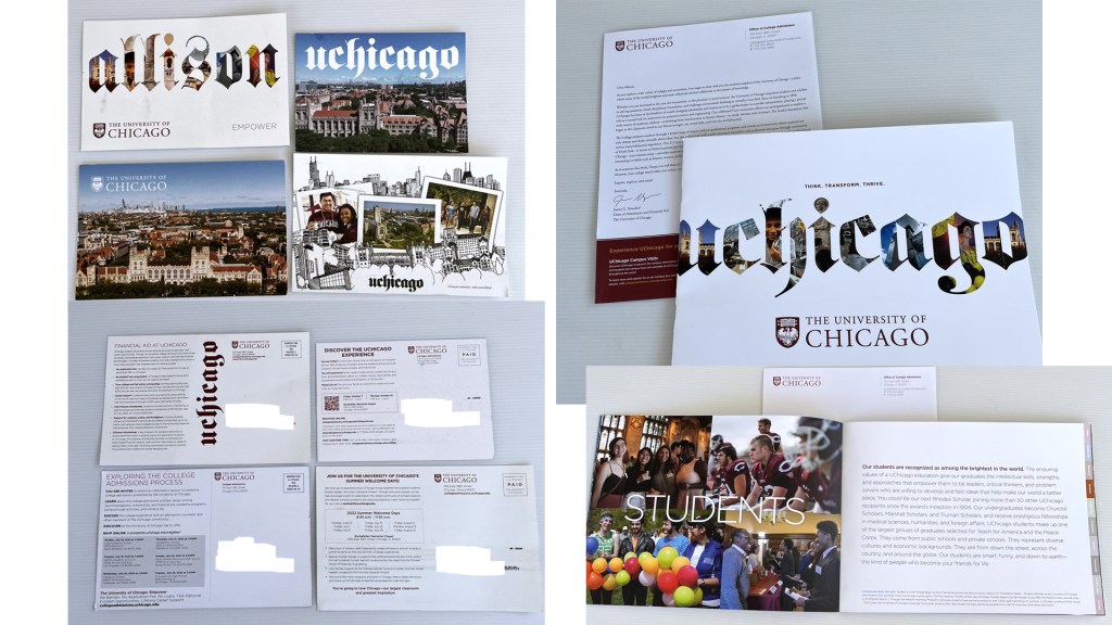
This is another one that has me scratching my head as to why the University of Chicago would be so interested in my student. Their acceptance rate is 7%. The only engineering program they have is molecular engineering. Yet, they have also sent six separate marketing pieces over the last several months. We’ve received four postcards, pretty standard. Although the one that’s personalized is pretty cool and definitely was eye catching when it arrived. The other two pieces are rather unique. One is a booklet that is surprisingly large at 12” x 9”. Each page is heavy cardstock, matte finish full color. The large pictures and large font size make it very pleasing to flip through. The pages offer a variety of insightful information on the campus, community, student life and notable alumni.
The final piece is astonishingly large! When it arrived in a standard large format envelope, I thought it was just another folded brochure, but as I opened it, I was shocked that the folds just kept opening to reveal a giant poster depicting a beautiful picture of the campus and surrounding area. The poster is 34” x 22” just for reference. If you know anyone who loves Chicago, let us know, we’ll send you the poster!


Y’all this University of Chicago poster is HUGE!!! My poor dragon favorite is dwarfed by it.
Winner: Best Visuals
University of Alabama, Tuscaloosa, Alabama
I was surprised that the University of Alabama sent recruitment materials to the Big One. I always think of it as a highly desirable big school. Not sure what they want with my kid, other than the out-of-state tuition! They sent a full-color glossy folded piece with a perforated die cut pennant attached. It’s pretty high-tech for a marketing piece. The die cut add-on must be pretty pricey. Though the pennant caught my eye, it was the other graphics and images on the piece that I liked the most. The 10 iconic spots on campus illustrations are intriguing. I want to check out the “President’s Mansion,” who wouldn’t? The images used on the center spread are more than just diverse smiling faces. They show a wider range of activities than most brochures that simply show racially diverse groups of beautiful people wandering among trees. They include academic and social settings which seem to depict a broader range of campus life than the typical college brochure.
This one also includes a photo of a recruiter on the mailing. This was a nice touch to put a face to the name of the random person mailing stuff to my student. I was also intrigued that her phone number area code is our local area code here in San Diego. Not sure if she just recruits from our region or what the story is there, but it gave me pause when I saw the number.

Winner: Best Overall Campaign
Tulane University, New Orleans, Louisiana
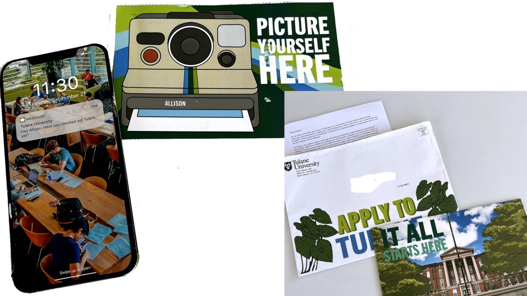
I’ve, of course heard of Tulane University, but don’t know much about it really. They sent several pieces over the last few months. They were my overall favorite based on colors, content, creativity and general visual appeal. Each piece is fun, with colorful, bold fonts, quality prints (the glossy, sparkly ink is very cool!). Additionally, they are actually trying to appeal to students. One piece is shaped like a cell phone and has a text message on the cover. Another piece looks like an instamatic camera. The pieces are also personalized, another nice touch. The honesty in the messaging is also appreciated. One postcard says “Hot Jazz, Heated Debates, Humid Weather.” Truth in advertising is a good angle to take!
Alas, Tulane does not have a good engineering program, so the Big One is not interested in applying. Besides, with an 8.4% acceptance rate, I am surprised anyone applies! It’s clearly tough to get in. If I were a college-age kid, I would want to apply just because of their snazzy marketing materials.


The Big One is still receiving materials from other schools, nothing to exciting or interesting. So far just more of the many, many standard letters and brochures that didn’t event deserve a mention because they did not stand out. If any of you are looking into a marketing career at the college-level, my advice think outside that standard postcard. It is boring and you’ve got an awful lot of super fun and creative competition out there!
